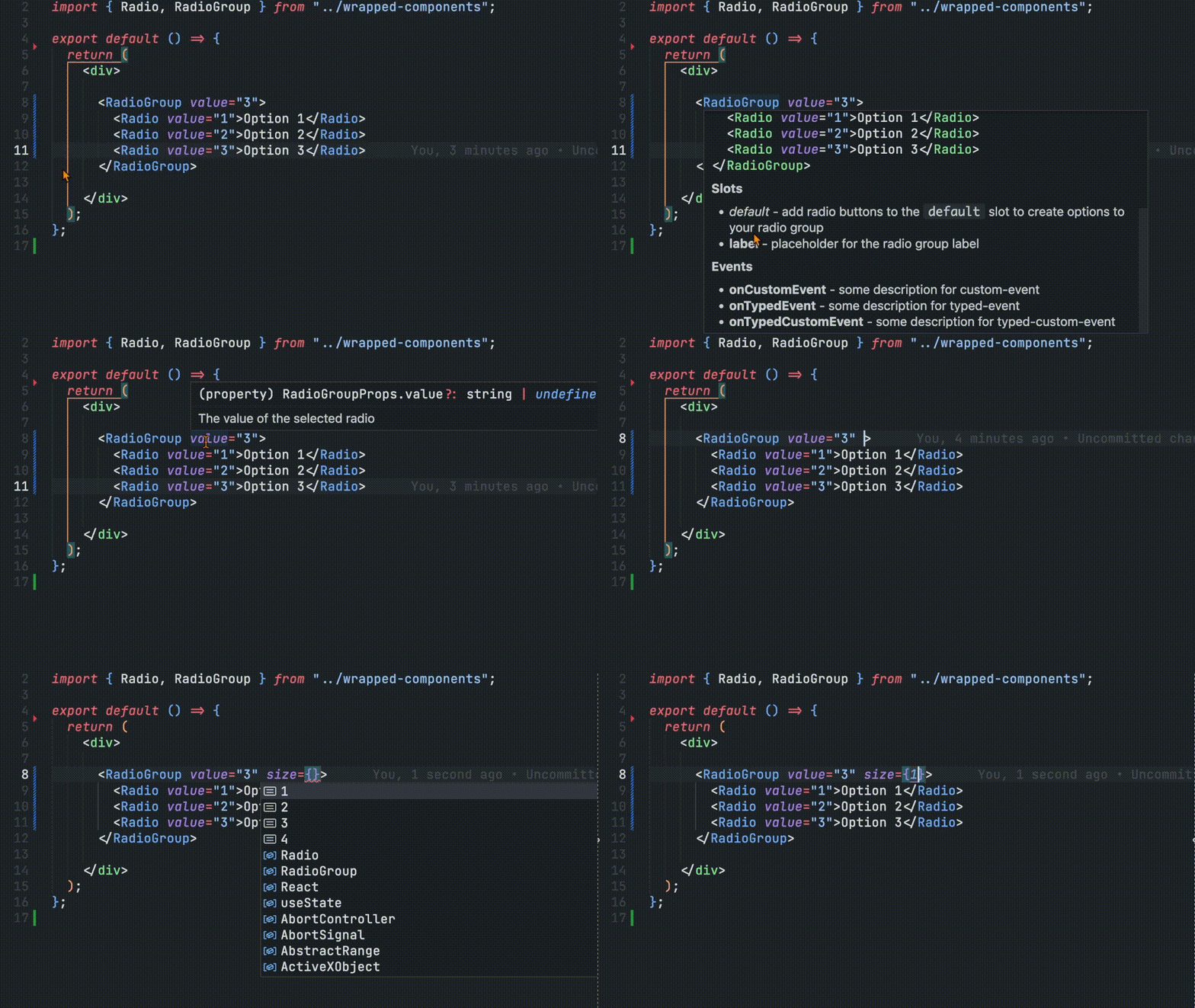
React Wrappers

This package generates ergonomic React wrappers for your Web Components straight from a Custom Elements Manifest (CEM) with not additional configurations or setup in your components. This package plugs into the CEM Analyzer flow or can be called programmatically to emit React components, types, and optional scoping utilities.
Overview
These wrappers are designed to bridge the gap between Web Components and React by generating type-safe React wrapper components. It reads your Custom Elements Manifest and automatically creates React components that:
- Forward refs to the underlying custom element
- Map attributes and properties correctly
- Handle custom events with proper TypeScript typing
- Support React’s JSX conventions and patterns
- Work seamlessly in both client-side and server-side rendering environments
Why React Wrappers?
While Web Components work directly in React v19+, using them earlier versions directly has several friction points:
- Event Handling: React’s synthetic event system doesn’t play well with custom events. You need
addEventListenerinstead ofonClick. - Property vs Attribute: React treats component props as JavaScript properties, while web components often rely on attributes or custom properties.
- Refs: Getting typed references to the underlying element requires manual type assertions.
- Server-Side Rendering: Custom elements are not supported in server-side rendering environments and can be tricky to integrate.
This package solves all these issues by generating idiomatic React components that feel natural to React developers while leveraging your existing Web Components.
Features
- 🔧 Automatic Generation: Creates React components and
.d.tsfiles with full prop types directly from your CEM - 🔒 Strongly Typed Events: Optional typed custom events where
.targetis the actual component instance - 💅 CSS Property Support: Includes CSS custom property types for styling
- 🧭 Flexible Tag Names: Supports custom tag formatting and scoped tags to prevent naming collisions
- 🧩 Complete Manifest Support: Respects attributes, properties, events (with custom event detail typing), slots, CSS parts, and CSS custom properties
- 🎯 Attribute Mapping: Handles React reserved words (e.g.,
for→htmlFor,class→className) - 🛡️ SSR Safe: Optional lazy element loading for server-side rendering environments
- 🧪 Customizable: Extensive formatting options for component and tag names with optional runtime scoping
- 📦 Tree-Shakeable: Generates individual files for optimal bundle sizes
- ⚡ Framework Agnostic: Generated from CEM, so it can be used with any web components library that can generate a custom elements manifest.
Installation
npm install -D @wc-toolkit/react-wrappersQuick Start
CEM Plugin Usage
The most common way to use this package is as a plugin in your Custom Elements Manifest Analyzer workflow:
import { reactWrapperPlugin } from "@wc-toolkit/react-wrappers";
export default {  plugins: [    reactWrapperPlugin({      outdir: "./react",    }),  ],};
Then run your analyzer:
npx cem analyzeThis will analyze your web components and generate React wrappers in the ./react directory.
Programmatic Usage
You can also call the generator directly with a manifest object:
import manifest from "./custom-elements.json" with { type: "json" };import { generateReactWrappers } from "@wc-toolkit/react-wrappers";
// Generate wrappersgenerateReactWrappers(manifest, {  outdir: "./react",  stronglyTypedEvents: true,  ssrSafe: true,});
This approach is useful for build scripts, custom tooling, or integrating with other build systems.
Using Generated Wrappers
After generation, import and use your components like any other React component:
import React, { useRef, useEffect } from "react";import { MyButton, MyButtonElement, MyInput } from "./react";
export function App() {  const buttonRef = useRef<MyButtonElement>(null);
  return (    <div>      <MyButton        ref={buttonRef}        variant="primary"        size="large"        onMyClick={(event) => {          // event.target is typed as MyButtonElement          // event.detail contains typed custom event data          console.log("Clicked!", event.detail);        }}      >        Click Me      </MyButton>
      <MyInput        type="email"        label="Email Address"        required        onMyChange={(event) => {          // if `stronglyTypedEvents` is true, event.target is typed as MyButtonElement          console.log("Value:", event.target.value);        }}      />    </div>  );}
The generated components:
- Accept all documented attributes and properties from your CEM
- Provide strongly typed event handlers (with
onprefix) - Forward refs to the underlying custom element
- Include JSDoc comments from your component documentation
What Gets Generated
When you run the generator, several files are created in your outdir:
react/├── index.js # Barrel export of all components├── index.d.ts # TypeScript definitions├── react-utils.js # Internal utilities for wrappers├── MyButton.js # Individual component wrapper├── MyButton.d.ts # Component TypeScript definitions├── MyInput.js # Another component wrapper├── MyInput.d.ts # Component TypeScript definitions└── ScopeProvider.js # Optional (if scopedTags: true)Each component file contains:
- Component Wrapper: A React component that renders the custom element
- Event Handlers: Automatic binding for all custom events with
onprefix - Property Management: Sync React props to element properties
- Ref Forwarding: Expose the underlying custom element via React refs
- TypeScript Definitions: Complete type safety for props, events, and refs
Configuration Options
All options work with both reactWrapperPlugin() and generateReactWrappers().
Core Options
| Option | Type | Default | Description |
|---|---|---|---|
outdir | string | "./react" | Output directory for generated files |
modulePath | (className, tagName) => string | Auto-detected | Function to compute import path for custom elements |
defaultExport | boolean | false | Use default exports instead of named exports |
debug | boolean | false | Enable detailed logging |
skip | boolean | false | Skip generation (useful for conditional execution) |
Type Safety Options
| Option | Type | Default | Description |
|---|---|---|---|
stronglyTypedEvents | boolean | false | Generate strongly typed event helpers |
reactProps | string[] | boolean | [] | Include React HTML attributes (true = all, array = specific) |
Component Customization
| Option | Type | Default | Description |
|---|---|---|---|
componentNameFormatter | (tagName, componentName) => string | undefined | Customize React component names |
tagFormatter | (tagName, componentName) => string | undefined | Customize rendered tag names |
scopedTags | boolean | false | Enable runtime tag scoping with ScopeProvider |
exclude | string[] | [] | Component class names to skip |
descriptionSrc | "description" | "summary" | string | "description" | Manifest field for documentation |
Mapping & Extensions
| Option | Type | Default | Description |
|---|---|---|---|
attributeMapping | Record<string, string> | {} | Map attribute names (e.g., for → htmlFor) |
globalProps | MappedAttribute[] | [] | Props to add to every component |
globalEvents | GlobalEvent[] | [] | Events to add to every component |
SSR & Build Options
| Option | Type | Default | Description |
|---|---|---|---|
ssrSafe | boolean | false | Lazy-load elements for server-side rendering |
Advanced Usage
Strongly Typed Events
Enable stronglyTypedEvents for maximum type safety:
reactWrapperPlugin({ outdir: "./react", stronglyTypedEvents: true,});This generates event type helpers:
// Generated typesexport type MyButtonElement = HTMLElement & {  variant: "primary" | "secondary";  // ... other properties};
export type TypedEvent<T = EventTarget, D = unknown> = CustomEvent<D> & {  target: T;};
export type MyButtonMyClickEvent = TypedEvent<  MyButtonElement,  { clickCount: number }>;
Use them in your app:
import { MyButton } from "./react";
function App() {  return (    <MyButton      onMyClick={(event) => {        event.target.value; // ✓ `target` typed as MyButtonElement        event.detail.clickCount; // ✓ typed as number      }}    />  );}
Custom Formatting
Component Name Formatting
Strip vendor prefixes or add namespaces:
reactWrapperPlugin({ // Updates the name of the react component: AcmeButton → Button, AcmeInput → Input componentNameFormatter: (tagName, componentName) => componentName.replace(/^Acme/, ""),});// Before: import { AcmeButton } from './react';// After: import { Button } from './react';Tag Name Formatting
Transform tag names at build time:
reactWrapperPlugin({ // x-button → acme-button tagFormatter: (tagName) => tagName.replace("x-", "acme-"),});This changes what’s rendered in the DOM, but not the component usage stays the same:
<Button /> // Renders <acme-button> instead of <x-button>Global Props and Events
Add props or events to every component:
reactWrapperPlugin({ outdir: "./react", globalProps: [ { attr: "data-testid", type: "string", description: "Test identifier for automated testing", }, { attr: "data-theme", type: '"light" | "dark" | "auto"', description: "Theme override for this component", }, ], globalEvents: [ { event: "app-telemetry", description: "Fired for analytics tracking", type: "{ category: string; action: string; label?: string }", }, ],});Every component now accepts these:
<MyButton data-testid="submit-btn" data-theme="dark" onAppTelemetry={(e) => { console.log(e.detail.category, e.detail.action); }}> Submit</MyButton>Server-Side Rendering (SSR)
When using React frameworks with SSR (Next.js, Remix, Gatsby, Astro), Web Components can cause issues because customElements doesn’t exist on the server. Enable ssrSafe to defer element registration to the client:
reactWrapperPlugin({ outdir: "./react", ssrSafe: true,});With ssrSafe: true, wrappers use dynamic imports in useEffect:
// Generated wrapper (simplified)useEffect(() => { import("../dist/my-button.js"); // Only loads on client}, []);This works seamlessly in Next.js App Router, Remix, and other SSR frameworks:
// app/page.tsx (Next.js App Router)import { MyButton } from "@/react";
export default function Page() {  return <MyButton>Works in SSR!</MyButton>;}
Runtime Tag Scoping
If your library supports multiple versions coexisting (e.g., my-button and my-button_v2), enable scopedTags and use ScopeProvider:
reactWrapperPlugin({ outdir: "./react", scopedTags: true,});Then wrap your app with ScopeProvider:
import { ScopeProvider } from "./react/ScopeProvider";import { MyButton, MyInput } from "./react";
export function App() {  return (    <ScopeProvider tagFormatter={(tagName) => `${tagName}_v2`}>      {/* Renders as <my-button_v2> instead of <my-button> */}      <MyButton>Scoped Button</MyButton>      <MyInput label="Scoped Input" />    </ScopeProvider>  );}
This prevents collisions when:
- Running multiple versions of the same component library
- Testing different versions side-by-side
Common Patterns
Attribute Mapping for React Reserved Words
React reserves certain prop names. Map them to alternatives:
reactWrapperPlugin({ attributeMapping: { for: "htmlFor", // <label for> → htmlFor class: "className", // class → className readonly: "readOnly", // readonly → readOnly tabindex: "tabIndex", // tabindex → tabIndex },});Including React Standard Props
Add React HTML attributes to all components. Teams may not want this because it will add these values to the autocomplete list and what prop types are allowed on the component, but may not actually add value to the component usage.
reactWrapperPlugin({  // Option 1: Include all React HTML attributes  reactProps: true,
  // Option 2: Include specific attributes (smaller bundle)  reactProps: ["inert", "editContext", "nonce", "spellcheck", "role"],});
// Now works with standard React props<MyButton spellcheck="false" role="button"> Button</MyButton>Custom Module Paths
For monorepos or custom entry points:
reactWrapperPlugin({ modulePath: (className, tagName) => { // Different paths for different component families if (tagName.startsWith("sl-")) { return `@shoelace-style/shoelace/dist/components/${tagName}/${tagName}.js`; } return `@my-org/components/dist/${className}.js`; },});Conditional Generation
Skip generation in certain environments:
reactWrapperPlugin({  // prevents the plugin from running  skip: process.env.SKIP_REACT === "true",
  // enables debug logging to the console  debug: process.env.DEBUG === "true",});